
For a quick bit of background, this sample is from a project I worked on with Edward Jones. Customer service call volume was getting out of hand, and the previous attempt to curtail this brought with it some other issues — the content was bad and worse yet, confusing.
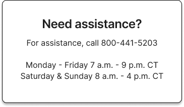
This card was displayed as a placeholder to replace the preexisting content (it was in bad shape) temporarily while I was writing the copy for the new initiative.
It would almost be better to have a 404 or redirect here, as this alone kind of "trains" users to do exactly what EJ hired me to correct. Control what you control.
Within a few days, I wrote, edited, & published the content seen below.
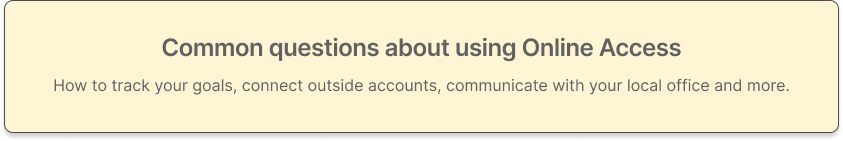
The first thing I did was to create a general header to help users get situated with a new page and process.
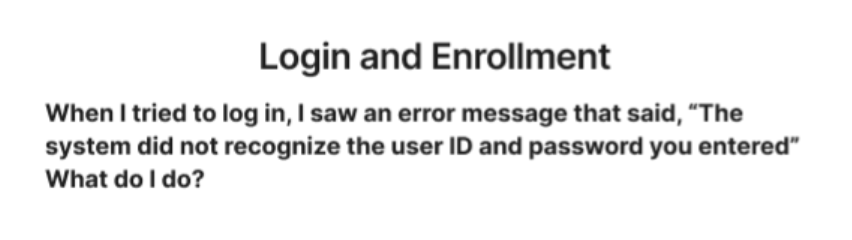
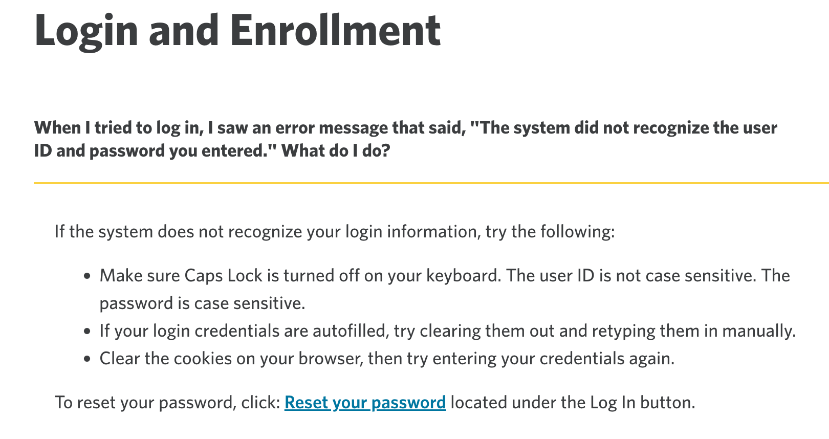
Since the FAQ here was about problems logging in and enrollment, I recreated an actual user query to help establish this new section, "Login and Enrollment"

This is the second and final step for this project: a step-by-step guide based on real user data that spoke to user pain points.
The final step for me is to make sure that Edward Jone's brand voice "business conversational" was adhered to. During the iteration process, I'm also cross-referencing my copy and the design guidelines to ensure it's in sync with EJ's Design System Guidelines.
This is a screen shot of the actual finished product. To see it live on their website, simply click on the picture.
This copy was approved to go live, and in Q3 of 2022 there was a 31% reduction in customer service phone calls related to this topic.